4 Mistakes to Avoid When Choosing Artwork for a Home
At Chicagoland Home Staging we’ve seen our share of mistakes made when displaying artwork in a home from proportions to quality to placement. Artwork is one of the most important finishing touches in a home. Our team loves using pieces that can add personality to a space and overall make the room look more cohesive and put together.
Choose your artwork wisely or it may feel off-putting to a home buyer or guest, but even more importantly it can leave you feeling unsatisfied with the result. No one wants that, so we’re sharing the top four mistakes to look out for when choosing wall art for your home:
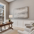
Size Does Matter

When the size on a piece of art is wrong, the entire room can feel unbalanced. In order to create a pleasing look in the space make sure the proportions of the artwork, wall and even surrounding furnishings work well together. For example, a small piece of art on a large wall looks awkward and feels out of place with the rest of the room. The opposite is true as well, a large piece of art in a small area can overpower a room. Choose a piece that fits properly on the wall like shown in this picture above — and for smaller pieces consider creating a collage to fill up space.
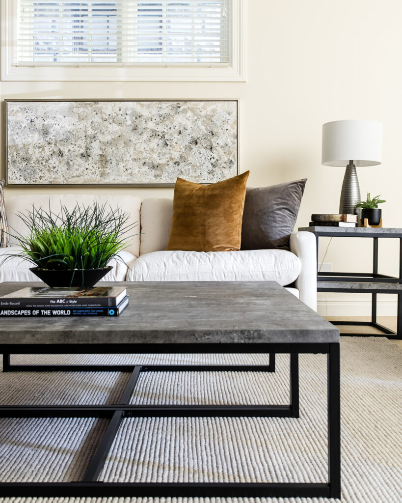
Color Clashing

Artwork shouldn’t be an afterthought, that’s why the colors in the artwork should be in line with your décor scheme. The artwork chosen will have a big impact on the style of the room and how you actually feel in it — so choose wisely. It’s easier to pick art you love first, then build a decor scheme around it to enhance the color palette in the artwork. We want the decor to compliment the artwork and to make the amazing piece stand out. For instance, notice how our team strategically used the art’s shape and colors pictured above with the blue and gray abstract art to set the tone with the rest of the objects in the space.
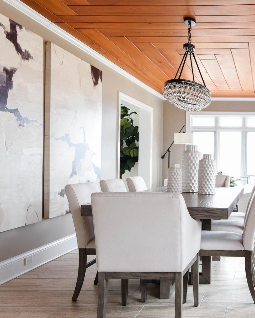
Frames ‘Gone Wild’
Like the colors of the piece, the frame defining the artwork should match your design style in the home. A frame can change the entire look of the artwork from a simple sleek frame in a modern space to a classic ornate style in a traditional home. The frame should balance the art and suit the space. This framed landscape mimics the color in the stone fireplace and the natural feel in the room.
Tone Down Art for Staging
If you’re planning on selling a property it’s important to choose pieces that don’t reflect any offensive, religious or political views in the artwork. Instead, opt for art that is neutral, enhances the positive features in the room and helps direct the buyer eye throughout the space.
Need artwork to help stage your property? Contact Chicagoland Home Staging for an instant home quote in DuPage County!