Home Staging Chicago’s Western Suburbs – A Single Color Palette
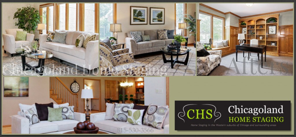
At Chicagoland Home Staging we tend to use a single color palette for the whole house. This design tactic unifies the space, making a statement that is cohesive. It affords a sense of connectedness and order that most buyers dream of having in their next home. A single color palette, by being less interruptive, tends to make living spaces feel bigger, with a sense of warmth and comfort. One room flows into the other in harmonious flow.
Our palette of soft green accents, in varying tints and shades, on a neutral background with pops of dark brown is Nature’s own approach to a landscape and it certainly worked well here on Hamilton in Naperville.
[I’m often asked what the difference is between a shade, a tint and then tone. Here’s my take on it:
A tint is added white – a shade added black – tone is when they add both, i.e.gray. Most colors in fabrics today are tones – for some reason they are considered more pleasing to the eye, “more complex, subtle and sophisticated” according to Houzz! Here is a fun reference on the how tints and shades affect the color wheel – http://www.color-wheel-artist.com/hue.html]
When walls and furniture are in neutral tones, they give the eye a place to rest and then get drawn to an accent – up to a piece of art, across to an accent pillow, down to the coffee table and on. By gently drawing the eye around a room, you have enabled the buyer to see the whole scope of it.
3 Reasons To Decorate with One Single Color Palette
- Unifies the space and makes a cohesive statement, a sense of connect-ness and order
- Makes it look more spacious
- Feeling of warmth and comfort – harmonious going from room to room – flow

