Sherwin Williams Releases Their Top Color Picks for 2021
Who’s ready for a change of pace at home? If you’re looking to freshen up your space, a splash of color has the power to transform the feeling of a room. Whether you’re looking to add more personality, warmth, or calmness to your humble abode the color experts at Sherwin-Williams, just released their 2021 paint color predictions.
Our team at Chicagoland Home Staging believes these nature-inspired, saturated colors will not only dominate decor trends in the upcoming year but will raise spirits as well as we continue to embrace life at home.
The paint company named 40 trendy colors, the “Rhythm of Color” a theme that is broken up into four palettes: Sanctuary, Encounter, Continuum, and Tapestry. Each palette has a combination of soft neutrals and vibrant accent colors to play with.
Here are some of our favorite paint colors we plan to embrace in our home stagings in 2021:
A Natural Sanctuary
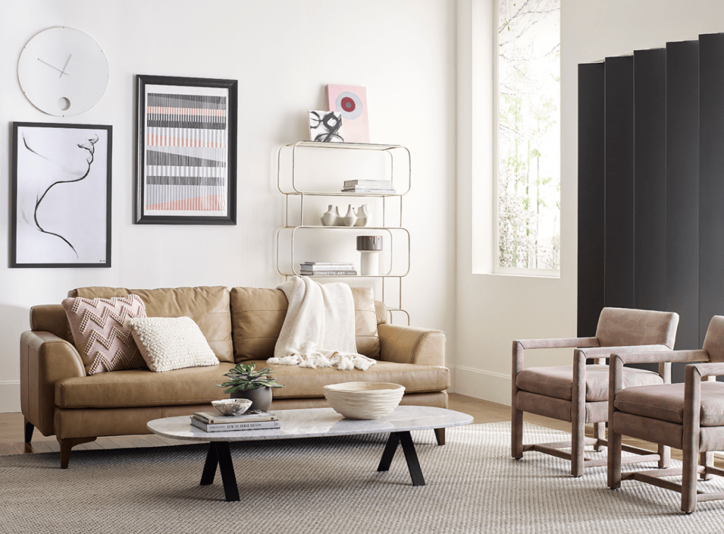
The nurturing hues of Sherwin-Williams’ Sanctuary palette, including warm neutrals and natural tones, including Pure White SW 7005, Modern Gray SW 7632, and Bona Fide Beige SW 6065 that provide a welcoming base to layer for layering natural materials, textures and decor.
We absolutely love the new go-to hue Canyon Clay SW 6054 that adds depth to the palette and is a refreshing change to a deep green tone that has been popular in the last few years.
An Earthy Encounter
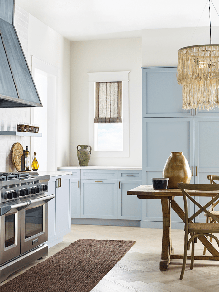
The Encounter palette also embraces natural hues from nature with more muted earth tones to create an “authentic sense of place.” The collection has a mix of blues like Jubilee SW 6248 that works well highlighting cabinetry and other positive features of a room. Tarnished Trumpet SW 9026, yellow mustard hue adds warmth, while Java SW 6090 adds a dimension of vintage style. Of course, these colors need neutrals like Alabaster SW 7008 and Natural Tan SW 7567 to provide a resting place for the eye. Notice, they’re forecasting a break in gray and moving towards more yellowish neutral undertones.
Rainbow-Color Continuum
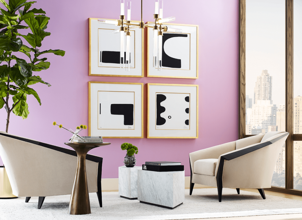
Now, while our staging team most likely won’t suggest painting your walls Novel Lilac SW 6836, this bright hue in the Continuum collection could very well be used to accessorize a contemporary space. This palette features bright, powerful hues like Limón Fresco SW 9030 and Commodore SW 6524 that are matched with cooler-toned neutrals such as Crushed Ice SW 7647 and Cyberspace SW 7076.
The Colorful Tapestry
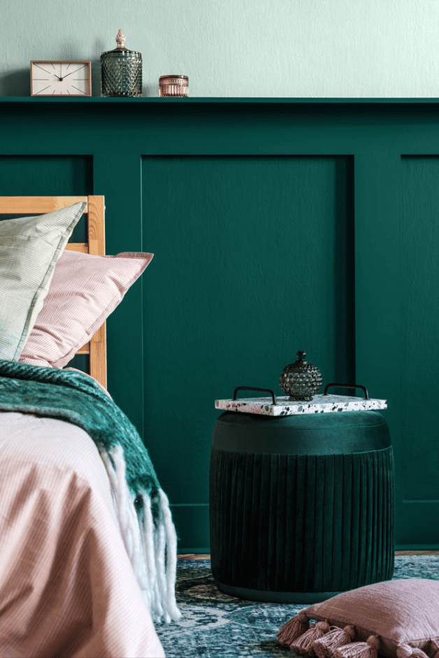
“Exuberance meets restraint” in the tapestry palette which features vibrant pinks, blues, and greens. Many of the colors in this collection, as in Continuum, would work well as a pop of color in a room when staging a property. We’d use these hues, Jovial SW 6611, Embellished Blue SW 6749, Aleutian SW 6241, Cape Verde SW 6482 to embrace a modern maximalist look or even in a playful space like a family or child’s room. This palette is mixed with both dark and light neutrals Tricorn Black SW 6258 and Greek Villa SW 7551.
Here at Chicagoland Home Staging, we stay ahead of the color trends to market and merchandise a client’s property that will “wow” buyers. Interested in learning how Chicagoland Home Staging helps you sell your home faster and for more money? Contact Chicagoland Home Staging for an instant home quote in DuPage County!


